Unit 35 - Good, Bad and the user experience for UI design
- Cade-Mason
- May 8, 2021
- 2 min read
In this task, I will provide evidence of research based on my findings.
In this blog I will cover the following parts of the user interface:
- the good
- the bad
- user experience
The good in web design
- Simplicity and minimal design
- Clean
- Linear
- User-friendly design (Dives
- Error-free
- Easy to use and understand
- Contrast in design
- Images that are relevant to the website
Examples:
Boosted
AirBnB
Dropbox
medium

virgin America

These images present what a good user interface design looks like. No cluttering, nice, convenient and clean. It's also easy for the psychology of the user experience (regarding User Interface)
Dropbox's UI is simplistic and linear in itself. On the design, dropbox looks like a website that is easy to use. Virgin America's UI comes off as convenient and settling to the user expereince
The bad in web design
- Over complications
- Cluttered design
- Non-user friendly
- Lack of contrast
- Non-responsive
- A boat load of text and no images
Examples:
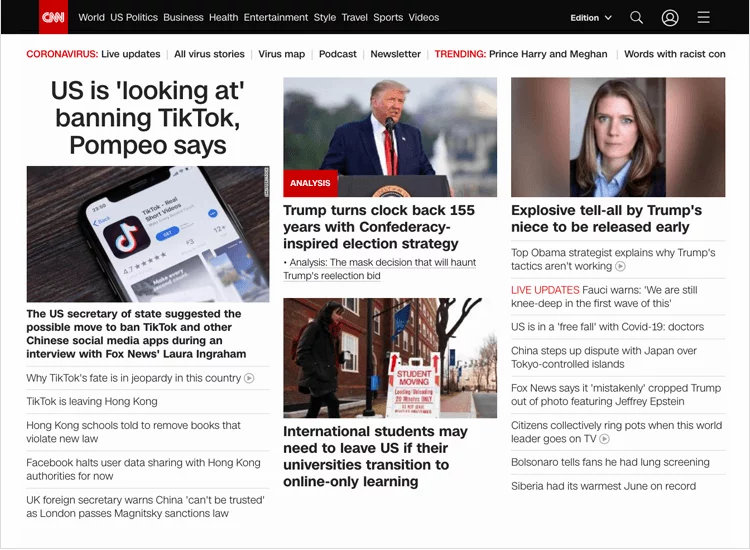
CNN:

UAT

Yale School of Art

Drudge Report

Craigslist:

MGBD Parts & Services

These images present what a bad user interface design looks like. A cluttered mess and the choices of the user interface really question what was going through the website designers head when producing the website at the time.
Craigslist has no images on its home page and looks bland and boring on the surface. It was as if this website was produced in the late 90s and no one has updated the user interface of the website since then. In essence, craigslist is a poor mans eBay.
I will do my best to avoid creating cluttered, complex messes of these websites.
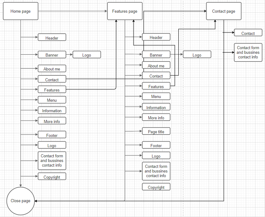
Overall, this has helped me give hindsight on the differences and examples of how good UI is presented and what bad UI looks like. With the wireframe in mind, I will take the UI design into consideration and work from there.


Comments