Creating the Game Design Prototype website.
- Cade-Mason
- May 28, 2021
- 2 min read
For unit 35, I had to create my own website.
For the website, I used a WIX ADI creation. I answered some questions and chose the 'portfolio' option this portfolio led to a 'Game Design Portfolio'.
The theme I chose for the website is minimal. The minimal theme is balance and simple with a touch of refinement. In terms of minimal, I decided to go with a black background and white text the reason why I went with this choice of colour is that:
"Our brains commit this to memory as a symbol. This can then be referenced later for recognition. If there is a lot of text on a dark background you can try reading it yourself and notice that your brain is struggling to interpret it not as a symbol but as content to be understood and committed to memory more how it would with dark text on a light background."
Examples
Logos
Billboards
Headlines
Media (movies/photos/etc.)
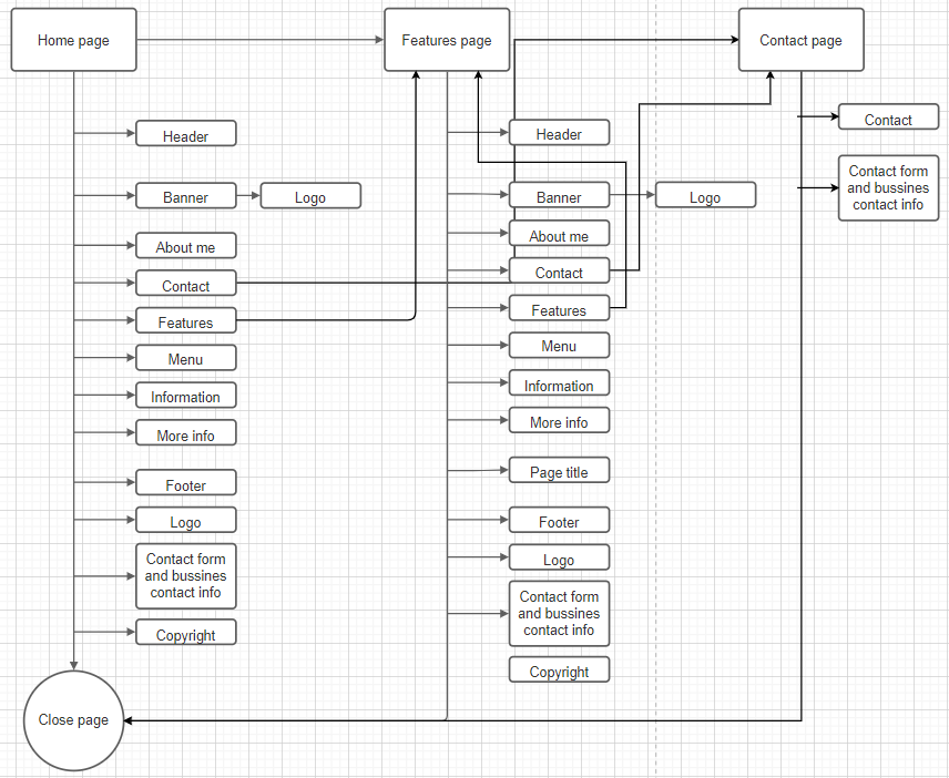
Next step of the process. The next part of this process is to create a wireframe and diagram.
I made a blog regarding creating my wireframe and diagram for my websites. Here are the wireframes I made on pencil and paper:


Once I had created the wireframe and diagram, I created my game design document website through Wix.
With this website, I took into consideration the psychology elements, what makes a good UI design for the website itself and what's convenient for the website.
Once the website is created, I plan on making a survey to gather customer feedback from focus groups.
Creating the game design website (version 1)
Creating my game design document website, I had thought and taken the following elements into consideration: - UI design (how it affects the overall user experience)
- User experience (psychology effects)
I will briefly explain my process of how I went about creating my website. Alpha product vs beta product
Before:


After:


The reason behind using different colours for the header, footer and blog strip is to make the page stand out and memorable. This is the psychological effect called
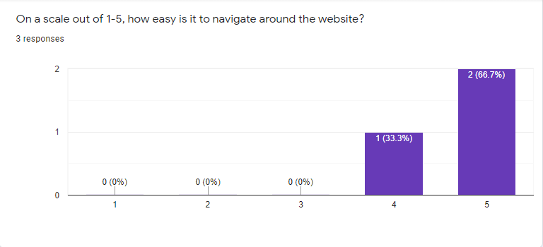
I have created a survey for my game design prototype website: Website link: https://cade-mason.wixsite.com/tower-of-hell-game
Survey results from testers feedback
I made a blog for testers' feedback to meet client needs. To keep it short, I asked for user feedback after they tested the website. I took the comments into consideration and made improvements where it felt necessary and to meet client user needs. https://cade-mason.wixsite.com/website-1/post/survey-feedback-from-user-interface-and-experience
Having made changes to the website based on testers comments here is the after version of the website's home page:


Blog page before (1st image) and after (2nd image):


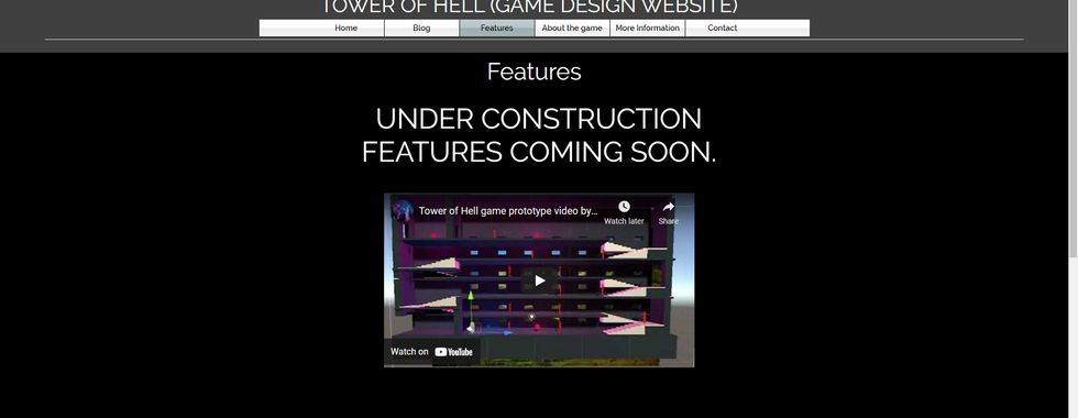
Features page before (1st image) and after (2nd image):


"About the game" page before (1st image) and after (2nd image):


More information page before (1st image) and after (2nd image):


Contact page before (1st image) and after (2nd image):


Overall, I am fine with how the website has turned out. Given time constraints, there isn't anything else I can do with the website. In the future, I could see myself going back to this website and making more adjustments depending on user feedback of the UI design presentation. This has taken me 5-6 weeks to create this website all the way from the wireframe (draft) process to the website design process.
Comments