Survey feedback from user interface and experience
- Cade-Mason
- May 28, 2021
- 2 min read
This survey presents the research results from feedback.
After creating the first version of the website, I had got testers to test my website and asked for overall user feedback for the website (via a feedback survey). The survey I created is in the link below:
I had received feedback from a couple of students from the focus group. These are the results: Q1:
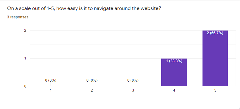
5 is the easiest and 1 is the hardest. According to testers, this was very easy to navigate around the website. Q2:
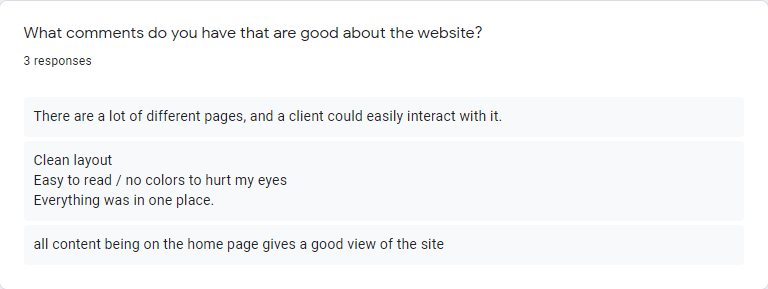
I asked my testers what was good about my website, the comments listed above were positive. According to one user, the website's "layout is clean". My intention for the website is to have a simplistic and linear website UI design. Q3:
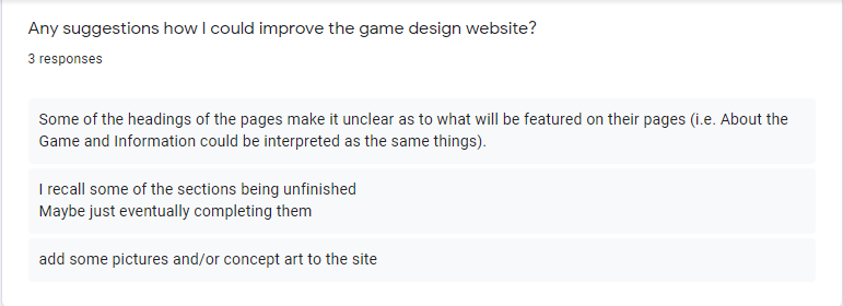
I asked my testers for suggestions on what I could improve for the website. Before I create the survey, the website is a work in progress hence why one tester states that "some sections of the website being unfinished." Hence why the website is a "work in progress". Q4:
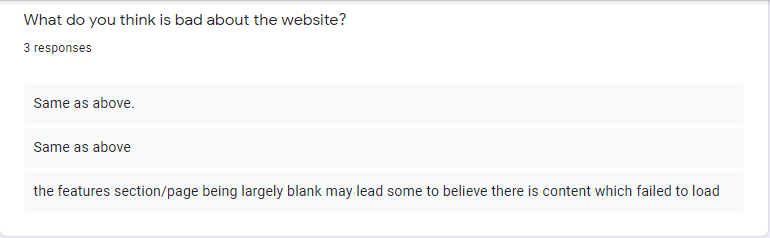
I followed it on with what the testers thought was bad about the website. According to one tester "the features section/page being largely blank may lead some to believe there is content which failed to load" For this I will add a strip saying "under construction". which relates to what the same tester said on question 7. Q5:

Every tester has said that the website works well for clients when it comes to psychology. One tester stated that "the blog section where regular document updates could be announced, and the contact form in the footer is also good for client participation." My intention behind this was to give subscribers or any participants providing updates on the game progress. I could do this as a newsletter or create news in a form of a blog post.
Q6:
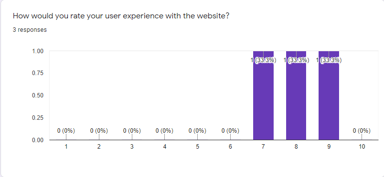
The scores are high with 9 being the highest which is really good and has a positive effect for testers for the website. It could go to a 10 with the improvements that will be made from the user/testers feedback.
Q7:
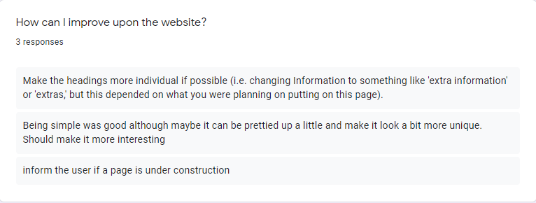
I asked my testers what improvements that I could do for the website. According to one tester, they experienced that "The headings should be more individual if possible". Reinforcing the same testers statement about "the headings of the pages make it unclear as to what will be featured on their pages (i.e. About the Game and Information could be interpreted as the same things)." To tackle this issue I could change the website header and pages or go on the home page keep the "about the game" and add an "extra information" page.
According to another tester, they said that the simplicity is "good although it could be prettied up and make the UI design of the website more unique." Whilst I can see where this tester is getting at I dont want too many colours occupying the website. I dont want any other colors on my website for the time being. The black, whites and greys are perfect and simplistic as is.
Overall user feedback has helped me spot things I couldn't and with testers helping out with the website I can go ahead and take action and improve the website itself.

Comments