Unit 3 Professional Practice: The Making of the "Tower That Never Was" Poster
- Cade-Mason
- Jan 16, 2021
- 3 min read
Updated: Feb 11, 2021
Having done the composition practices I needed to take those skills and techniques into creating my poster.
The contents for the minimum viable product (MVP) I needed in this poster are: - The title
- The protagonist and antagonist
- Composition techniques
- My own images (photo shot)
- Billing block
The first thing I did was I created a photoshop with the portrait orientation at large-sized poster.
These are the dimensions:

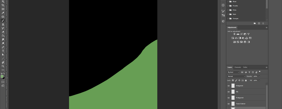
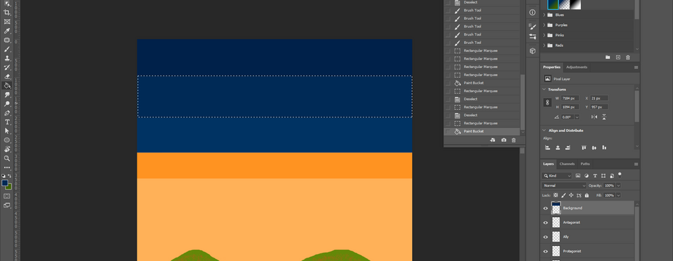
Once that was opened up I create layers for the protagonist, ally, antagonist, background, foreground.


For the foreground, I was making hills. The first design I wasn't really fond of so I was experimenting with foregrounds and backgrounds in order to create a good composition.
With the background, I produced a field and then added more hills into the background. With small details, I used a different paintbrush which I wanted to create roses on the fields hills. I used a form of a gradient (multiple colours to create the composition of lighting.


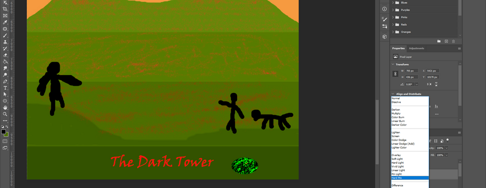
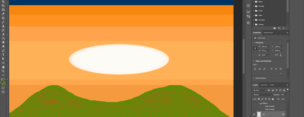
To add more details into the background, I created a sun with a form of a composition technique (that I had previously used in one of my blogs.)


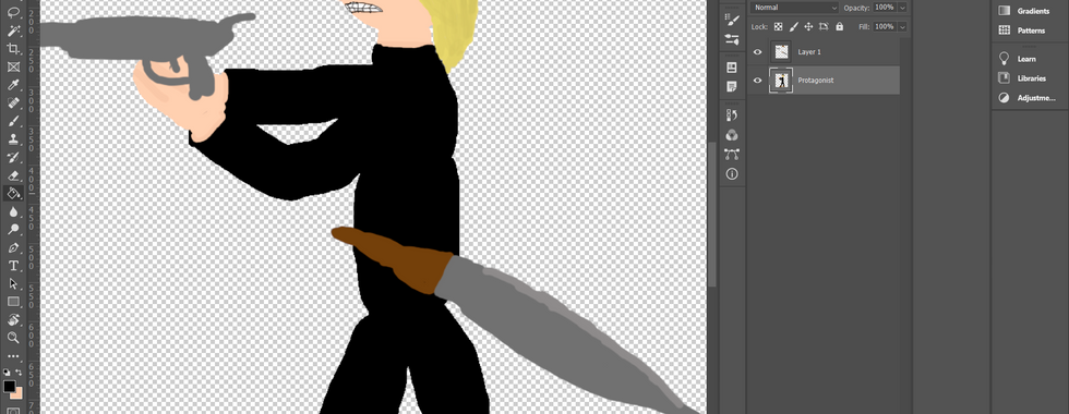
The next thing I did was that I created (loose but no strong) figures. Each figure represents a character in the composition. On the right side of the poster is the protagonist and ally (dog) and on the left side is the antagonist.
I added a title called 'The Dark Tower' I noticed that this was an error so it got changed to 'The Tower That Never Was' later on. Title name aside, I gave some visual effects to the poster. In the blending options, I implemented a few blending nodes inside of the title.
Once the figures were added I brought some of my own images into the composition by creating composition techniques inside. For the grass, I used one grass image then used the blending options and copied the image throughout the poster I change the blending node to pin light as the shadow and lighting worked well for the grass. Once I was done copying the grass image I did 'layer > flatten image.' From there, I opened up curves and played around with the channel.


The next thing I did was that I created boxes for the characters. What I wanted to do with these boxes was to keep most of the proportions of the characters inside of the box. I thought this technique worked well as it helps me know where to exactly place the characters in the composition. I did do 'convert to smart object' on the character layers as it would be more convinient for me to add details on. I added details to the characters to themselves however I felt it was a low effort all I did was add lighting, shadows, accessories. That said, we weren't being assessed to do characters. The billing block is what mattered which is what I went on to do.
Having added the billing block, the people I added into my composition were the people I referenced in my essay aside from Stephen King and John Williams.


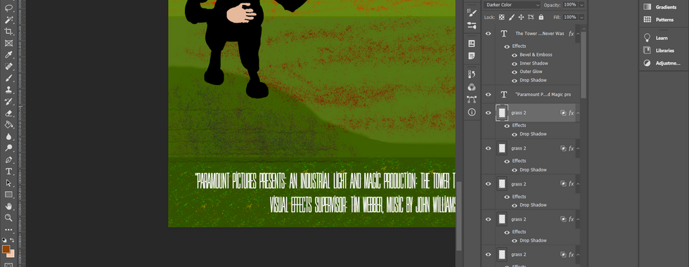


Here is the final composition of the poster:

(Sadly I had to get a capture of this poster as the file size is too big to upload onto Wix. Meaning that the file itself has been compressed.)
If you want to know what my thoughts are on this poster I am doing a project review in one of my other blogs. Please check it out! (Insert URL here.)

Comments