Style Research: The chosen 3 artists
- Cade.M
- Jan 30, 2020
- 2 min read

Updated: Jun 9, 2020
Researching into styles and presentations, I've decided to look into 3 artists. These artists will give me inspiration, supporting my own ideas of story/play-boards. I will be analyzing either their techniques or approaches when it comes to style. With that being said, I will go over 3 artists to draw inspiration from my synoptic project. Makoto Yukimura Makoto Yukimura is a Japanese manga artist for the works: Planetes and Vinland Saga. His art for the work; Planetes is crisp, clean, and detailed (especially in the colors) it's well composited. This artwork is from the 1st volume of Planetes.

The artwork I've chosen to analyze is Makoto Yukimura's Planetes, (From the first volume of Dark Horse's manga release in English) presents the story, atmosphere and setting that is, Planetes. Here we see a character outside of the space shuttle with a planet from the background. Personally speaking, I love manga. Planetes has sharp, strong color tones and composition going for it. I also find that it's still strong when it's black and white though inferior compared to the colored art for pl,anetes as you receive a better composition, natural feel, and atmosphere. In the background, there is an occurance of opacities and color gradient use. In this sense, this illustrates the atmosphere or the layers of a planet itself.


David Hardy
David Hardy is considered to be one of the most influential space artists of all time. This piece of art work presents an extravagant and well-crafted art work. The color pallets are well made, presents multiple moods and faces of the earth. This shows a lot of diversity within the artwork itself. Creating reflecting images of the world. The artwork itself is also a great reflection, it's all formed as an eye. This could imply that how we see things around the world by vision. Personally, I think this art piece is amazing and stood well for its time. It looks like this would go well as a documentary TV logo or an album cover.

The composition itself has this cold and calm feeling about it. The dark, blue, and bright colors make up for a well established and vast piece. Representing one circle of the earth, mars, and moon.
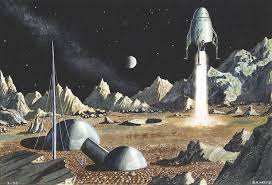


Robert T. McCall
Robert McCall is an American artist that worked for NASA and created posters for movies such as 2001 Space Odyssey. He specializes in outer space art. His famous works are the Apollo, 2001 Space Odyssey, and Meteor.
The artwork; First Men on the Moon is painted with oil and is used on a canvas. Robert's painting is incredible. Personally speaking, the artwork is ahead of its time. Many colors are used, the shading is powerful with its perspectives and colors. (More or so on the left side.) A well-composited piece that's blended in with a vast passion. With its presentation, the artwork is spirited and powerful accompanied by strong contrast, dynamic colors.
Robert's style is realistic and this kind of artwork should meet for my teams Synoptic project.


Comments