Character Sheet for playboarding
- Cade.M
- Apr 30, 2020
- 4 min read
Updated: May 29, 2020
One of our tasks in play-boarding is to create a character sheet. In relation to my Synoptic project, I decided to make a female counterpart of the protagonist. I took this into consideration as this would correlate to our Synoptic project. Later on, this would be an unused concept for the project itself. Regardless, I still continued on with it.
Here is my unused concept design for the character from VFX synoptic project:

Even when I was working on this character sheet I really didn't like how it turned out and how formed together. The whole design in itself feels rather poor so what I did instead was I went back to square one. Going back to the start I decided to make an original character for a design sheet without relating to the synoptic whatsoever. Furthermore, this character has a different design, theme and overall character in itself. The first thing I did was open photoshop and gathered some references for the character design sheet. I want to gather materials in which I could make loose inspiration. Here I would make a character design mood board
To show things off here is my character design mood board:

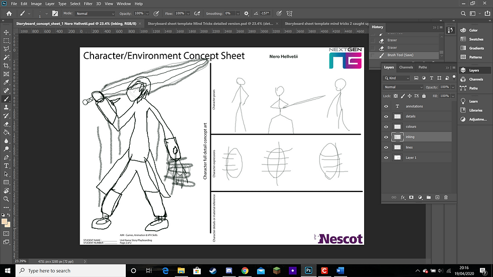
So I started drawing the character design sheet concept and I created the lines to get the right structure and proportions for the character. Honestly when drawing the face and head in perspective seemed rather off and misproportioned to me. It was like a rotating at 70 degrees with the face being aligned to it. The characters name is called Nero Hellvetti
Some trivia on this character. 'Nero' is 'black' in Italian and 'Helvetii' is 'inferno' in Finnish. Although there is only one "L" in "Helvetii" I added another "L" after the first L in Helvetii, I decided to give it another L so it would create an evil name for the character. And due to flames can represent hell I added the L because of it

Luckily enough, I thought this through and have decided that it would be best if I colored it over in the colors layer. There this would get rid of the faces perspective. I had to adjust proportions of the head however to get what I wanted instead of getting

As for the dark smoke I wanted to give this character a kind of aura that's dark something that gives him the evil or chaotic personality to his character. Alongside that of his menacing face.
In these images, I made some adjustments for the mouth and mask of the character, I felt that the scaling and proportions were off so I adjusted to a degree that felt appropriate to my liking.
I would add details and color to the character, I would create gloves, shoes, flames, sword colors, buttons, etc. So on the first week of Tuesday after easter holidays, I had a voice/video chat discussion with Luca. He provided a drawing method called the Loomis method.
The Loomis method is where you get a body or head portrait. From there you draw a circle on top of the head then you create an axis spot for the character's head itself. You need 3 lines down horizontally. Those 3 lines being: Eyes, mouth, and chin. When the circle is created you also need to create an axis point (creating a plus sign) inside the circle itself. This is your guidance point as to where the 3 lines locate itself. Now at the back of the axis point from the head is where you place the ears themselves. Furthermore, to strengthen the faces, you can create a roughly 45-degree angle to know where the jawline is for the character's face.
Overall I created 3 facial expressions for the Loomis method I got rid of the lines and crosses originally and then used the Loomis method for each expression, I created an angry, neutral, and smiling expression.
Once that was done I filled in colors and some detail to the character. I gave the most detail to the angry face.

Originally in my design, I was going to add a scar burn to the left add to add more detail however, I didn't use that design as it would've taken too much time and it didn't help I was technically late on getting the design in on time itself.
That being said, from here I created the character poses next.
Despite the character poses looking like stickmen figures, I gave Nero some detail, expression, and design for the poses themselves. One example is that Nero's sword striking pose comes into effect when his dark aura is about to be unleashed int he first and second images you can see clearly that Nero is about to send down a powerful strike. This reflects on his aggressive personality.
Once filling the character poses color and details, I created a character bio, whilst it may not seem necessary in an artist's perspective I wanted to create a bio from the get-go.


Overall, I've come to terms and acknowledge the facts that concepts can get unused and other concepts are just better fleshed out. To be completely honest here I thoroughly enjoyed creating Nero Hellveti, he was a fun character to create, and one of these days I am hoping to use him as a character in one of my own projects in the future. I don't know when that'll happen but I am hoping it to be very soon. 5-10 years' time.


Comments