2D/3D Concept of Imagined World
- Cade.M
- Jan 9, 2020
- 9 min read

Updated: May 25, 2020
(Warning, this blog is incredibly long!)
I started to work on my imagined world concepts since last week (7/10/19).
How I went around with my imagined world concept was that I would blend 2D and 3D elements. 3D for the buildings, shapes, and perspective. 2D for the art, composition, and style of the world.
Entailing from my last blog: Images and Sounds for Imagined Worlds: Video Game Concept Arts, I was very inspired and motivated to produce this Imagined Worlds piece that I have created. Because of this I went on to create my own imagined world. Entailing the concepts of open world, freedom, abandonment, survival.
I created thumb-nailing sketches of my imagined world concepts. At first I have created parts of it rather than the full pictured thumbnail scene of an imagined world. Then later down the line I would keep drawing some more and said: "I had enough of this, I want to do 3D instead!" With that being I went back and forth on the idea. That's when I came to the conclusion I would blend 2D and 3D elements into one piece in a creative manner. To me that was how the brain was processing it as.
After the thumb-nailing, I picked 2 top ideas of my thumbnails. Of course I didn't go with parts of the scene I went with the full pictured scenes themselves so this made my choice incredibly easy.
So I went into Maya and created 3D architectures and environments isolated into the imagined world. Essentially, I translated the thumb-nailing into the 3D architectures and environments and it executed well. However I did bump into issues whilst producing my concept. The visibility of environments and the blending of architecture colliding into another shape.


I created screenshot(s) of my 3D composition so I could capture the image and implement this onto Photoshop. Then I would trace over the 3D shapes to translate the drawings into 2D by maintaining the accuracy for the drawings themselves.
So I started my 2D concept art in Photoshop. I created multiple layers: Foreground, Background, Buildings, Cloud and Mist, Mountains, Screenshot (3D concept) and Guide. I created guides to create a rule of thirds for the perspective and proportions. With that being said, when I worked on my concept art I would have guides invisible most of the time. I only turned guides on to see what the perspective looks like and how and where the rule of thirds would be focusing onto the 3x3 format. My guides (in my opinion) don't feel a 100% ACCURATE. Why I say this is because it's noticeable in the middle which takes unequal spacing compared to the others.
Afterwards, I traced over the screenshot shapes and buildings. I did this because this maintained the accuracy and proportions of buildings themselves. On top of that, this would help me color over the shapes. The last thing I intend to do with the screenshot is make the 3D concept visible once all the procedures, detailing and coloring is done.
Once tracing was done I would color in my concept art and then add the gradients on the foreground layer. The gradients would have a light and shadow effect to them when adding gradients to the concept art. I use gradients on foreground for the lighting and color effects by adding detail. I did not want a flat green field (that originated from the screenshot itself. To add more detail, I attempted to make a cliff which would overlook.

As you can see in this circle that was my (poorly attempted) cliff. It will need improvement but for now I had to focus on getting the shading, lighting, shadow and details done.
Afterwards I would entail on to producing details on the foreground. I did research and Luca showed me something interesting based around my concept art. How the greens go on top of each other:

Notice how there is a different variety of brushes, colors, tones and shading we're used? Here you have a really strong concept art in regards to detail. Without further ado I went on add some grass details on the foreground and add some shading to the environments and buildings.
Before I started to get into detailing. I would increment and save from time to time with this project.
Here I will show a comparison of detail and one without detail:


The first picture shows without the details and foreground itself. In the second picture however there is a major difference when detail and foreground occurs. The third picture still has foreground however has a lot less detail. I added mist to create an effect of detail for abandonment.
To add more detail there were a couple of parts of detail I added. A new tower and a few birds. The birds we're simple, I drew them like 2 tick marks colliding into each other. As for the building however, I created the building I Maya. Here I will show the procedures of how I built this.
In Maya I created a cube, stretched it out. Then on the face itself, I would extrude the face in subdivisions for the edges and extrude the face from there.


After Extruding I would add the Cylinder and then the Polygon Torus shapes. Here I scaled up the cylinder shape itself because it was the top end of the tower. As for the Polygon Torus however it was the mid part of the tower itself.


Then I would proceed to take a screenshot and place it into Photoshop, then quick select, place it in the comp and then trace like I have with everything else for the environments.


Afterwards I proceeded to add small parts of detail in the mountains by creating a cloudly like mist and some detail on the snow itself.

To add further detail I would proceed to use the blur tool. I was given this advice by my friends Louis and Izzy. Being the not so good artist I am, I was told to add some blur to the mountains, mist and shadings.
As my friend Izzy is a skilled artist, I asked by preference what she thought was better by a presentation on my force-field for the dome in the city. Was it better with or without the blur tool? Turns out it was better with blur tool on as it gives the effect of a natural force field rather than a flat force field on its own. One thing I should've done was that my layers should've been separate in the first place. Due to me being an incompetent artist I forgot to do so. That would've made things more convenient.


(Add pictures here)
Once that was out of the way I've been thinking about how I could go and produce a strong, powerful and front cliff on the foreground perspective. Reference to what you saw earlier on in this blog, my cliff looks and feels incredibly weak for what it is.
Aside from that, I am going to show different variants of my artwork without foreground, layer effects etc. This will illustrate vast differences in each piece.


In the first image. This excludes the foreground and effects. This is solely focused on background and environments. On top of that, it feels like a lot is missing due to the exclusion of the foreground with the effects aside from it.
The second image includes the foreground and some of its detail on another layer. Here I have created layers of grass to make the concept look and feel more natural and detailed in its own right.
The third image excludes some of the detail however, the foreground is still there. I used a gradient tool earlier on in my concept art process. You can see some squiggly white blurry lines. Here I was creating a form of mist for my concept.
Here is my full composition on my concept art from this phase;

I brought up my concept art when discussing with Sam. He said if there was one thing to improve on it would be the mountains themselves. They presented in a way that was too pointy, flat and don't complement the mountains well. In fact, they should look more swollen and round. Another point Sam mentioned was that to try and get the "abandoned" feel put more emphasis and exposure for the darker colors and shading that makes it look and feel "abandoned" in the presentation.
I would add shading and lighting techniques for my composition to reinforce and add detail


As I was working and looking for ways to improve my work. Photoshop kept consistently freezing out on me. I didn't have many tabs open and there was only a couple of software in tasks. To prevent that from happening I had to press the ESC key as many times for it to unfreeze. Can be a couple of times up to 10 times for the ESC key to function to the file again. This was advice taken from Luca. From there I would add a rustic brown detail than to strengthen the cliff itself.


Having strengthened the cliff itself I had create another layer called guides and I went with a very dark color to make the cliff stand out from the foreground in contrast. Luca assisted me hereby strengthening the cliff and reinforcing it with guides. Afterward Luca would add detail such as grass which is what I wanted. A brown, rough ground occupying with bits of grass on the cliff itself.


The cliff itself is overlooking the lands themselves. Giving breathtaking views and imaging the character itself isolating into the world. Speaking of character, I implemented a character in the concept art. This character would be on the cliff overlooking the city. This would reinforce my statement as to what I was saying. Therefore, this would create a sense of immersion in itself.
I created my character using the "guide" layer and drawing a box itself then adding a stick figure to maintain accuracy and proportions of character. I looked up color codes for the character's skin as I wanted to go with Caucasian.
Used the hex code; #ffcd94 RGB (255,205,148) When I was getting the RGB colors to use I had to use the tick box in photoshop to change color nodes.


Originally, this was my character for the composition however, the proportions we're kind of slim and the perspective itself felt mismatched. I personally wanted my character to look towards the city surrounding the mainlands itself.


For my composition, Luca would help me produce guides to correct and match perspective. This would then go on to illustrate as a square grid. Making it the rule to place the characters, objects, and assets on the cliff itself. The guidelines themselves are purple. The guidelines would help my assist the character's proportions and perspective and from there I began to recreate my character and adapt a few things in the design.


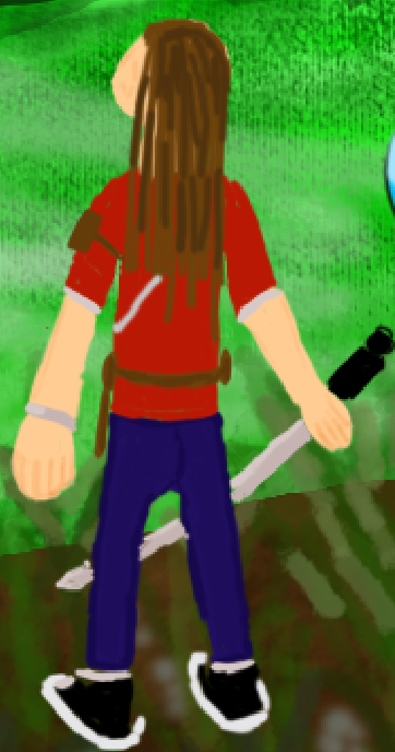
First image is before and the second image is after. The character details, proportions, and perspective see significant improvements compared to the first image.
Having done the character and the cliff. I was unsure what to do next, were about to go into detail. For a while I looked at my concept art I was like "Meh is there really anything else I could do? Where do I go from here?" Then I look at one part of the concept art; the background. The mist and clouds. I feel like the clouds we're harder to see and not as stood out as I wanted it to be so I create some new and better clouds for the concept.

Experimenting opacities and brushes the opacity I used was around 40-60% and the brush itself was a soft round brush for the mist. I got Luca to have a look at my work again and there were a couple of things to improve on. Adding more detail to space out the foreground, adding black outlines to the character and creating a strong mist in the mountains.
Afterward I added black outlines for the characters. Once that was done I proceeded to create some trees around the bottom left area of the concept art to surround the environment. After creating the outlines of the tree themselves, I filled in the outlines of the trees with a brown colour and for the lcoloreaves themselves would be a darker green color. I will be adding some shadows and lighting to create a realistic effect.


My trees looked too bold for what they should've been. What I mean by bold is that the tree looked too close and takes the attention away from the character itself. What I did was I toggled the layer out of view. From there, I would create a new brush and proceed to create flat branches to gather references from the internet. Luca helped me out on this part for Jungle concept arts. Creating the brush I applied lighting and shading effects for the detail. Luca wanted me to expose only the leaves on the trees rather than the branches themselves. We saw this in the concept arts and they only expose the tree leaves rather than branches and wood itself. Here's what the concept art looks like in its stage:

It's all coming together and I dare say I am proud of this work! The next step of this project is to create sounds for a soundscape in ISIW.
And then came filling in the holes in each layer. Work became much more technical and finicky. However I got lucky. Luca was doing some demonstrations for the class to work around the ISIW's. He wanted my concept artwork as an example for demonstration. Thanks to this, Luca filled in the holes of my concept art work for each layer.
This really helped me out efficiently and dare I say, I didn't have to put that part of the effort in as it gives me the advantage to get to the phase. artwork
With all of that out of the way, I will go over the next phase in my next concept ISIW blog. This blog is long, tedious and I won't drag this blog out any longer.
On that note here is the link to the next stage of concept ISIW: (insert URL here.)

Comments